
Improving Customer Self-Service with a Streamlined Documentation Portal
Designing and developing a unified documentation portal that turned scattered PDFs into a living ecosystem of knowledge.

Role
Lead Designer
Lead Technical Writer
Lead Developer
Tools
MadCap Flare
Figma
Adobe CC
Industry
Healthcare Technology
Overview
When I joined the team, documentation wasn’t a portal, it was a maze. PDFs were buried across shared drives, renamed by IT, and passed around in email threads like lost artifacts. Customer support reps spent hours digging for the right file, only to find an outdated version. Customers, meanwhile, were out in the field trying to troubleshoot in noisy, low-light environments on equipment that often didn’t even have speakers.
It wasn’t just inefficient; it was eroding user trust.
My mission quickly became clear: create a unified, accessible, and maintainable documentation system that made knowledge easy to find and even easier to use.
Discover
Stepping Into Complexity
The first step was understanding the real problem, not just what leadership thought was broken, but what users were actually experiencing.
I began by interviewing 15 people across our three main audiences:
Customer Support Representatives - the first line of help for customers calling in with urgent issues.
Service Partners - external technicians who needed reliable integration and troubleshooting guides.
Customers - pharmacists, system admins, and techs, all working in fast-paced environments where every second mattered.
Their stories painted a sobering picture: everyone was improvising, patching together their own solutions because the system didn’t serve them.
“Sometimes I just email the last version I can find,”
-Support Rep.
That was the first insight: videos weren’t helping in every use case, they were hurting usability.
Surfacing Assumptions
When I met with the leadership team to kick off the project, they were confident that customers wanted only video tutorials. It sounded plausible, but it didn’t align with what I was hearing.
So I ran a cost-value comparison.
I tracked the time, effort, and cost to produce a single high-quality video versus a written guide, and showed that text not only scaled better but was far more practical for real-world conditions.
Written documentation was:
Easier to maintain
Faster to produce
More accessible in low-bandwidth environments
The result: we pivoted as an organization. Written-first documentation became our foundation.
Mapping the Real Need
Through journey mapping, I learned that each user’s path was unique, but their frustration was universal.
Support reps were buried in disorganized drives. Service partners used outdated PDFs. Customers couldn’t find what they needed fast enough.
It wasn’t just an information problem; it was a trust problem.
Define
Framing the Path Forward
The problem was no longer abstract. It was human.
I reframed the challenge into one sentence:
Create a single, accessible documentation portal that serves multiple audiences seamlessly, without overwhelming any one of them.
To achieve that, I needed to align every insight, assumption, and system requirement into a cohesive strategy.
What I Learned from the Research
Documentation was organized by product, but that was the extent of the organization, which made finding information slow and confusing.
Internal documentation wasn’t being written consistently, leaving customer-facing teams in the dark.
Even within the customer group, multiple personas existed, pharmacists, pharmacy techs, and IT staff, each with distinct visibility and needs.
The fragmented ecosystem called for structure.
Evaluating Solutions
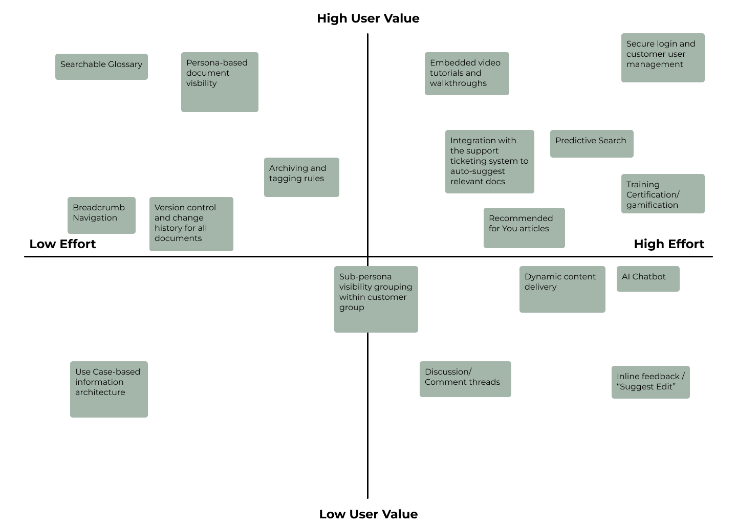
I brainstormed and mapped dozens of potential features, then ranked them using a Value-Effort Matrix. What would deliver the highest value with the least friction to build and maintain?
High-value, low effort priorities like unified navigation, search optimization, and structured categories made the first release. Ambitious ideas like AI chat integration were flagged for future iterations.
Feasibility Realities
Midway through the project, the biggest twist arrived: I’d be coding my own designs.
As a first-time developer, it was intimidating. Suddenly, I wasn’t just designing the experience, I was building it, debugging it, and ensuring it would stand up to real users.
I also had to design for the unknown: I hadn’t been given the green-light to hire my own team yet. What skills would they have? What could I reasonably expect?
That meant the system had to be technically simple to update, visually consistent, and nearly impossible to break.
Develop
Designing, Building, and Learning - All at Once
Every decision in this phase was a balance between design intent and technical feasibility. I quickly learned that design decisions directly shape functionality, and that coding brings its own form of creative problem-solving.
One day, a loading issue appeared in the live build. It took me hours, but I fixed it myself, a small victory that reminded me I was learning to think like both a designer and a developer.
Information Architecture
Early on, documentation followed no clear logic, it was loosely grouped by product and it took nearly a week of sorting to even understand the scope of the over 10,000 pages of technical content that the portal would be containing.
After analyzing usage patterns, I reorganized everything around use-case order, within each product:
Implementation Guides
System Overviews
Release Notes
User Guides
Maintenance Guides
Each audience followed the same sequence, but visibility varied by persona. Customers saw only their relevant guides, while support reps and partners accessed the full ecosystem.
Wireframes & Testing
Low-fidelity wireframes helped me iterate on navigation and layout.
I conducted usability tests to measure findability and comprehension. Participants could locate key documents 30% faster after restructuring the categories.
Iteration
During testing, one repeated pain point stood out: users wanted an easy way to contact support when they couldn’t find what they needed.
So, I added a persistent support contact card on every page.
Simple. Effective. Immediately loved.

Accessibility & Identity
Because this portal supported several medical products, I had to meet WCAG 2.2/Section 508 compliance. I optimized contrast, font size, focus states, and markup, ensuring it wasn’t just functional, but inclusive.
The final identity used clean typography and color pairing to convey confidence, consistency, and trustworthiness.
Deliver
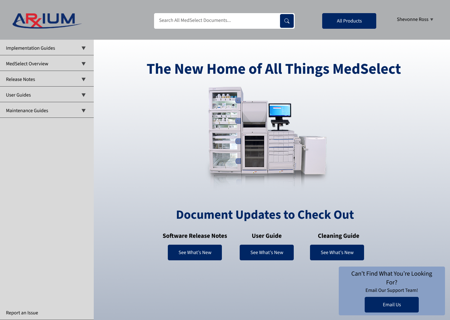
High-Fidelity Mockups
The portal’s interface was intentionally minimalist, clear hierarchy, collapsible sections, and search front and center.
Every page led naturally to the next, reflecting the same clarity the project name promised.
From Prototype to Portal
When the final version launched, it felt like more than a site, it was an ecosystem finally in sync.
Each audience had its own tailored experience, yet the structure remained unified.
Support reps now had a single, searchable source of truth.
Service partners had reliable integration references.
Customers could self-serve quickly, even from a dimly lit hospital basement.
Next Steps
To evolve the system, I planned two features with the leadership team for a subsequent release:
An AI-powered chatbot for natural language documentation search
A Salesforce support ticket integration system to close the loop between users and support
These next steps would keep the ecosystem alive and learning.
Reflection
What I Took Away
This project was where I learned the true depth of UX, that clarity isn’t aesthetic, it’s structural.
I learned how accessibility laws shape design, how maintainability shapes architecture, and how design decisions echo through code.
But most of all, I learned that clarity is an act of empathy.
It’s what happens when design meets understanding.